Job: Logotype
Year: 2025
Nexus Powergen
Nexus Powergen is a company specialized in energy solutions, with a focus on performance, reliability, and innovation.
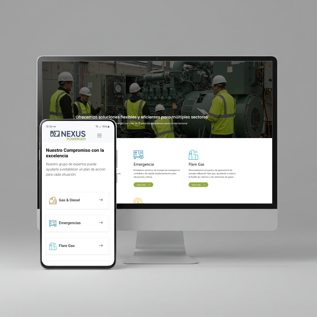
The project involved the complete development of the visual identity and the design and development of the corporate website. The visual proposal emphasizes technical clarity, robustness, and modernity, reflecting the brand’s positioning within the energy sector.
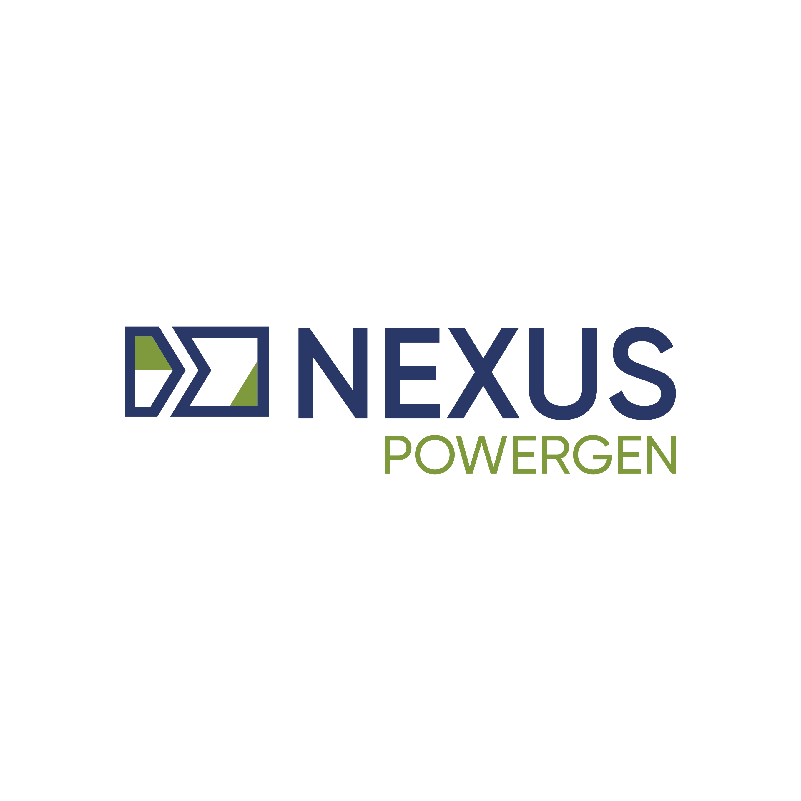
Logotype
The Logotype:
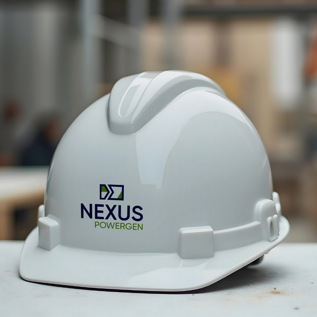
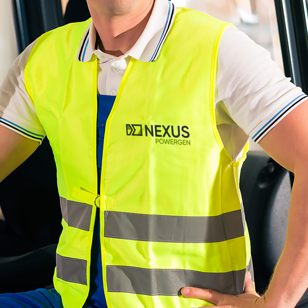
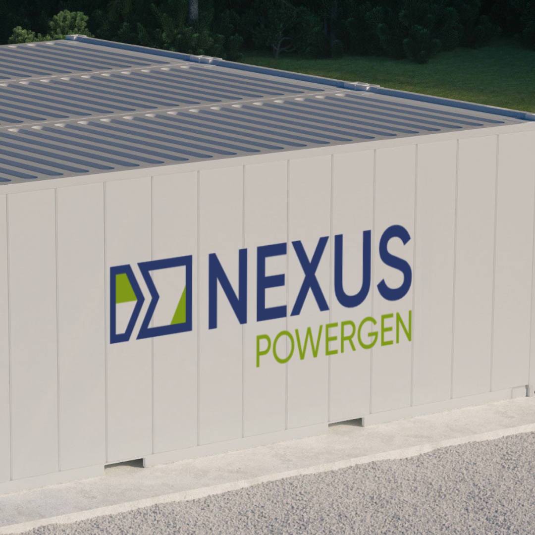
The Nexus Powergen logotype was built upon a technical and symbolic concept: the relationship between inductive and capacitive reactive power—key elements in the energy industry. The graphic arrow represents the flow of energy from the generator to the client, illustrating the company's role as an active provider of solutions.
The symbol conveys movement, direction, and control. The typography, with its geometric and contemporary lines, reinforces clarity, objectivity, and solidity.
NEXUS is set in Gilroy SemiBold in blue, highlighting the ideas of connection and stability.
POWERGEN appears in Gilroy Medium in green, emphasizing innovation and a focus on clean energy.
The contrast in weights and colors establishes visual hierarchy and reinforces the brand's core values.
Nexus Powergen’s color palette combines blue and green, underscoring both its technical foundation and commitment to sustainable energy solutions.
The iconography was designed to communicate technical information in a simple and direct manner, using clean lines, balanced shapes, and a minimalist language that supports a cohesive visual identity.