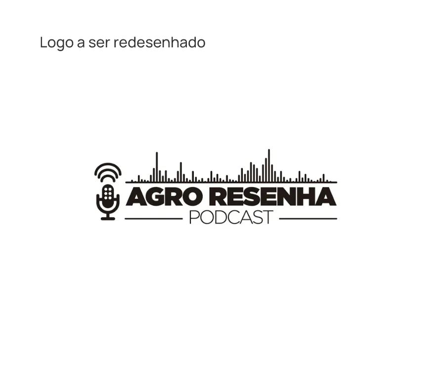
Agro Resenha is a podcast focused on entrepreneurship in agrobusiness. Brand redesign was requested to enhance its legibility and achieve a more minimalist aesthetic.
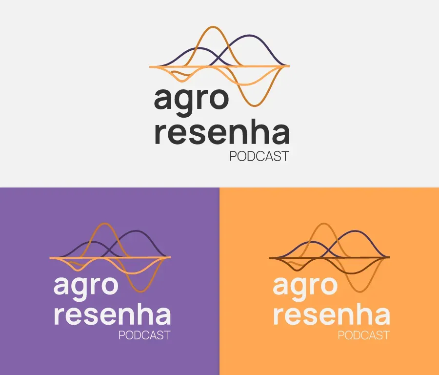
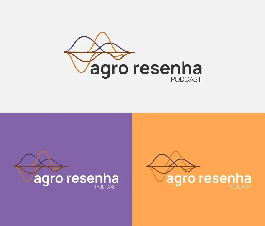
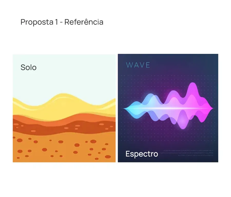
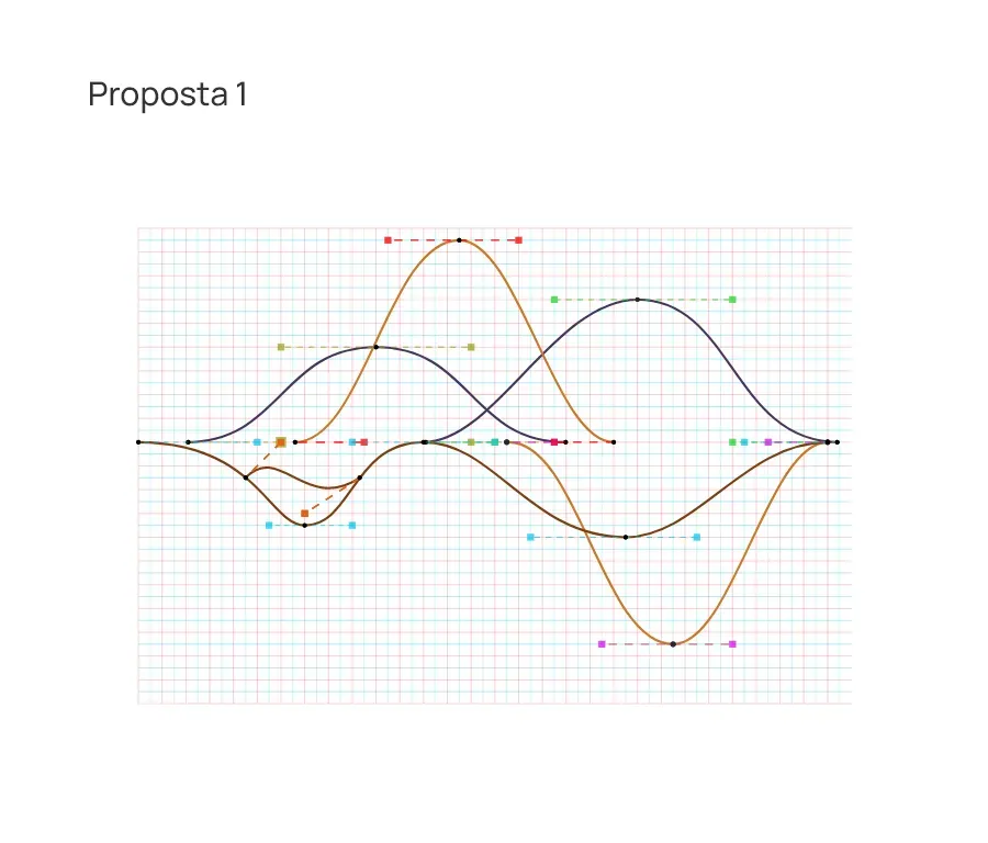
The new brand draws inspiration from soil layers and soundwave spectrum, represented by curved lines at the bottom symbolizing soil layers, and curved lines at the top for the soundwave spectra.
Click here to view the Brand Manual.
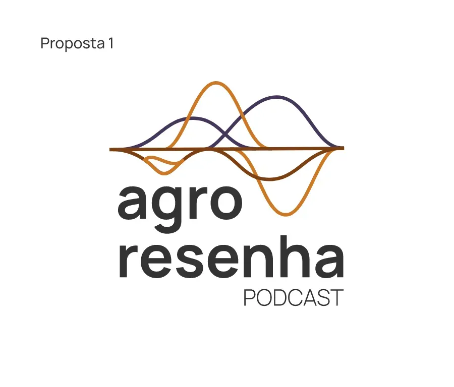
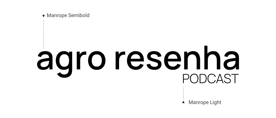
Manrope is a modern sans-serif typeface with excellent legibility even at significantly reduced sizes, making it highly suitable for the brand.
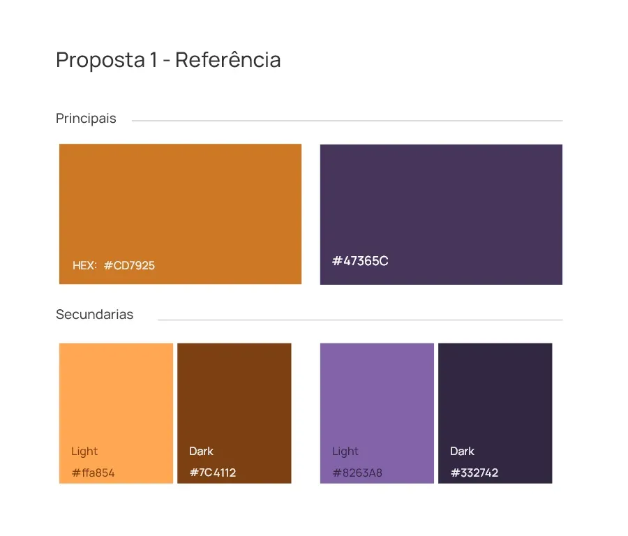
The chosen colors are earthy tones and lilac, symbolizing technology and entrepreneurship.